Search the Omeda Knowledge Base
Personalization – HTML Templates
Summary:
The Personalization tool allows Olytics users to target audience members directly through various types of dropdowns, headers, and more. Create your own from scratch or try one of these 6 HTML templates:
- Suggested Content
- Webinar/Event Registration
- Subscription Prompt
- Subscription Renewal
- Profile Update
- Email Confirmation
Note: Any images used in these templates are free for you to use
Template 1: Suggested Content
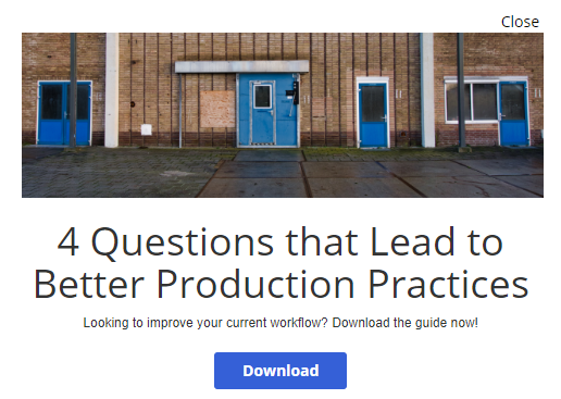
Goal: Provide special content in exchange for information from the consumer (e.g. email address, name, etc)
This personalization works well with the use of a relevant image. Content could include, but is not limited to, whitepapers, feature news stories, industry reports, year reviews, etc. You can also use this to highlight content from an advertiser.
Suggested Use Cases
- Converting contacts from anonymous to known
- Cross-promotions
- Sponsored content
Recommended Personalization Type/Presentation Setting:
- Standard: Use the modal presentation setting for the most direct messaging. For a subtle push, set the presentation to the Lower Right or Bottom Middle.
- Exit intent: Use the Modal or Header Popup presentation for the most natural UI –both positions less effort to engage with compared to presentations that appear on the bottom of the screen.
- Scroll Trigger: Use the Bottom Middle or Modal presentation for the most natural UI.
- Inline (HTML Injection): Use the Modal, Footer or Header Popups, or Bottom Middle presentation to promote the most natural flow for the consumer.
Suggested Frequency: Once per day
Ideal For:
- Anonymous visitors
- Recurring visitors
- Special audience segment(s)
Suggested Content – Sample

Suggested Content – HTML Code
<p><img src="https://cdn.omeda.com/hosted/images/CLIENT_OMP/OSM/blue_doors.PNG" alt="doors" width="480" height="152" /></p>
<h1>4 Questions that Lead to Better Production Practices</h1>
<p>Looking to improve your current workflow? Download the guide now!</p>
<div><input type="button" onclick="olytics.clickGo(this,'https://www.google.com/');" style="margin: 0; padding: 6px 26px; border: 0; font-size: 15px; font: inherit; vertical
-align: baseline; float: none; width: auto; background-image: none; letter-spacing: 0; -webkit-box-shadow: none; -moz-box-shadow: none; box-shadow: none; -webkit-text-shadow: none; -moz-text-shadow: none; text-shadow: none; background
-color: #3560d7; color: #ffffff; font-weight: bold; line-height: 1.6; -webkit-border-radius: 3px; -moz-border-radius: 3px; border-radius: 3px; cursor: pointer; min-width: 0; min-height: 0; height: auto; transition: background 0.2s ease; margin
-top: 10px;" value="Download" /></div>
Template 2: Webinar/Event Registration
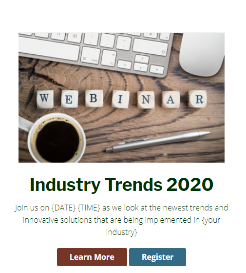
Goal: Encourage webinar/event registration from website visitors
This personalization has multiple design options. One is to use a redirect to the registration page with more details. Another is to embed a registration field into the personalization so that users can register directly in the popup for a seamless UI.
Use Cases:
- Webinars
- Virtual Events
- Live Event Registration
Best Personalization Type/Presentation Setting:
- Standard: Use the modal presentation setting for the most direct messaging. For a subtle push, set the presentation to the Lower Right or Bottom Middle.
- Exit intent: Use the Modal or Header Popup presentation for the most natural UI –both positions less effort to engage with compared to presentations that appear on the bottom of the screen.
- Scroll Trigger: Use the Modal presentation as it gets closer to the day of the webinar/event. The other presentations settings are have their own benefits of use as well. The best placement will depend on your page design. For the highest conversion rates, place this on pages that are related to the webinar/event content so when a visitor starts to scroll on a page they receive this personalization.
Suggested Frequency: Once per day
Ideal For:
- Anonymous visitors
- Recurring visitors
- Special audience segment(s) (e.g. those who have previously attended a webinar or those who have consumed content similar to the webinar content)
Webinar Registration – Sample

Webinar/Event Registration – HTML code
<h2><img src="https://cdn.omeda.com/hosted/images/CLIENT_OMP/OSM/webinar.PNG" alt="New Webinar Announcement" width="423" height="267" /></h2>
<h2><span><strong>Industry Trends 2020</strong></span></h2>
<p><span>Join us on {DATE} {TIME} as we look at the newest trends and innovative solutions that are being implemented in {your industry}</span></p>
<div><input type="button" onclick="olytics.clickGo(this,'https://www.google.com/');" style="margin: 0; padding: 6px 26px; border: 0; font-size: 15px;
font: inherit; vertical-align: baseline; float: none; width: auto; background-image: none; letter-spacing: 0; -webkit-box-shadow: none; -moz-box-shadow: none; box-shadow: none; -webkit-text-shadow: none;
-moz-text-shadow: none; text-shadow: none; background-color: #763626; color: #ffffff; font-weight: bold; line-height: 1.6; -webkit-border-radius: 3px; -moz-border-radius: 3px; border-radius: 3px; cursor: pointer;
min-width: 0; min-height: 0; height: auto; transition: background 0.2s ease; margin-top: 10px;" value="Learn More" /> <input type="button" onclick="olytics.clickGo(this,'https://www.google.com/');
" style="margin: 0; padding: 6px 26px; border: 0; font-size: 15px; font: inherit; vertical-align: baseline; float: none; width: auto; background-image: none; letter-spacing: 0; -webkit-box-shadow: none; -moz-box-shadow: none;
box-shadow: none; -webkit-text-shadow: none; -moz-text-shadow: none; text-shadow: none; background-color: #336b87; color: #ffffff; font-weight: bold; line-height: 1.6; -webkit-border-radius: 3px; -moz-border-radius: 3px;
border-radius: 3px; cursor: pointer; min-width: 0; min-height: 0; height: auto; transition: background 0.2s ease; margin-top: 10px;" value="Register" /></div>
Template 3: Subscription Prompt
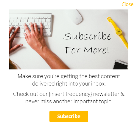
Goal: Convert website visitors to subscribers (both paid/unpaid)
There is a lot of flexibility with this personalization; you can stay with a basic text or build out some creative design elements. Sometimes, less can be more – the easier you make it to subscribe, the more likely someone will provide the required information. Consider capturing the most important details necessary. For those using Dragon Forms, you can mask the opt-in button and have it unseen, so the UI is cleaner.
Use Cases:
- Anonymous visitors
- Recurring visitors
- Special audience segments (e.g. users who have downloaded content, who have a specific job function, previous event attendees, etc.)
Best Personalization Type/Presentation Setting:
- Standard: You can change the presentation depending on how often someone frequents your site. For recurring visitors, consider using the modal presentation setting for the most direct messaging. For a subtle push, set the presentation to the Lower Right or Bottom Middle. For image-less designs the Bottom or Top persistent bars are equally successful – for these, consider setting a slight delay to allow your visitors a moment on the site before the persistent bar appears.
- Exit intent: Use the Modal or Header Popup presentation for the most natural UI – both positions require less effort to engage with compared to presentations that appear on the bottom of the screen. Let them know how they would benefit from subscribing.
- Scroll Trigger: Use the Bottom Middle or Modal presentation for the most natural UI. Once again, for text-based personalization, Header or Footer popups are also nice to use.
- Inline (HTML Injection): Use the Modal, Footer or Header Popups, or Bottom Middle presentation to promote the most natural flow for the consumer.
Suggested Frequency: Once per day; Once per week
Ideal For:
- Anonymous visitors
- Recurring visitors who aren’t subscribed to a product
- Special audience segment(s) (e.g. those who already have products, but not the one you’re promoting)
Subscription Prompt – Sample

Subscription Prompt – HTML code
<div>
<div>
<div>
<h3><img src="https://cdn.omeda.com/hosted/images/CLIENT_OMP/OSM/subscribe_for_more.PNG" alt="Subscribe for More" width="437" height="222" /></h3>
<div>
<h4>Make sure you're getting the best content delivered right into your inbox.</h4>
<h4>Check out our {insert frequency} newsletter & never miss another important topic.</h4>
<div><input type="button" onclick="olytics.clickGo(this,'https://www.google.com/');" style="margin: 0; padding: 6px 26px; border: 0; font-size: 15px;
font: inherit; vertical-align: baseline; float: none; width: auto; background-image: none; letter-spacing: 0; -webkit-box-shadow: none; -moz-box-shadow: none; box-shadow: none; -webkit-text-shadow: none;
-moz-text-shadow: none; text-shadow: none; background-color: #ffbb00; color: #ffffff; font-weight: bold; line-height: 1.6; -webkit-border-radius: 3px; -moz-border-radius: 3px; border-radius: 3px;
cursor: pointer; min-width: 0; min-height: 0; height: auto; transition: background 0.2s ease; margin-top: 10px;" value="Subscribe" /></div></div>
Template 4: Subscription Renewal
Goal: To save time/money while increasing the number of subscriptions that are renewed automatically
The use of this personalization allows your subscribers to renew their subscriptions more easily. Depending on your business model, you can set up your audience query to pull X months in advance and adjust the messaging accordingly. Consider putting this personalization as part of an Odyssey and having this run in conjunction with email notices.
Use Cases:
- Soon-to-Expire Subscribers
- Expired Subscribers (messaging may change slightly)
Best Personalization Type/Presentation Setting:
- Standard: For account-related notifications, consider the header dropdown or persistent header/footer presentation style. Depending on the proximity of the expiration, consider using the Modal to establish hard-to-miss messaging.
- Exit intent: Use the Modal or Header Popup presentation for the most natural UI – both positions require less effort to engage with compared to presentations that appear on the bottom of the screen. Encourage them to renew their subscription before leaving.
Suggested Frequency: Once per month; Once per week; Once per day (depending on how far in advance you begin to run the message)
Ideal For:
- Known customers with expiring subscriptions
- Expired Subscribers
Subscription Renewal – Sample

Subscription Renewal – HTML code
<div>
<div>
<div>
<h2>Hi @{first_name}@</h2>
<span>Your subscription is due to expire {insert time e.g. this month, next month}</span>
<p><span>Renew now to prevent an interruption in your content!</span></p>
<div>
<div><input type="button" onclick="olytics.clickGo(this,'https://www.google.com/');" style="margin: 0;
padding: 6px 26px; border: 0; font-size: 15px; font: inherit; vertical-align: baseline; float: none; width: auto;
background-image: none; letter-spacing: 0; -webkit-box-shadow: none; -moz-box-shadow: none; box-shadow: none;
-webkit-text-shadow: none; -moz-text-shadow: none; text-shadow: none; background-color: #5887c8; color: #ffffff;
font-weight: bold; line-height: 1.6; -webkit-border-radius: 3px; -moz-border-radius: 3px; border-radius: 3px; cursor: pointer;
min-width: 0; min-height: 0; height: auto; transition: background 0.2s ease; margin-top: 10px;" value="Renew" /></div>
Template 5: Profile Update
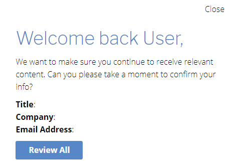
Goal: To have known visitors build out and/or update their existing profile and provide additional information
This template is the Swiss Army knife of personalizations; it covers everything from progressive profiling to email confirmation. You can use this to redirect your web traffic to their profile page or you can embed a form directly into this personalization, allowing your consumers to easily provide updated information.
Use Cases:
- Progressive Profiling
- Email Confirmation/Update Prompt
- New Demo Fields
Best Personalization Type/Presentation Setting:
- Standard: Any of the presentation settings can be successfully utilized for this type of personalization. Note: if you are going to have a lot of text or if you are going to embed fields directly, the persistent bars (top or bottom) may not look the best aesthetically.
- Exit intent: Use the Modal or Header Popup presentation for the most natural UI. Keep the pop-up close to the top of the browser in order to encourage people to follow the CTA of the personalization.
- Scroll Trigger: Use the Bottom Middle, Bottom Right or Modal presentation for the most natural UI. It also keeps this type of messaging from appearing pushy.
Suggested Frequency: Once every 2 weeks, Once a month
Ideal For:
- Known customers with missing demos
- Known customers with invalid/expired email addresses
- Specialized audience segments (e.g. farmers)
Profile Update – Sample

Profile Update – HTML code
<div>
<div>
<div>
<div>
<h2><span>Welcome back @{first_name}@,</span></h2>
<p>We want to make sure you continue to receive relevant content. Can you please take a moment to confirm your info?</p>
<div><strong>Title</strong>: @{title}@</div>
<div><strong>Company</strong>: @{company}@</div>
<div><strong>Email Address</strong>: @{email_address}@</div>
<div></div>
<div><input type="button" onclick="olytics.clickGo(this,'https://www.google.com/');
" style="margin: 0; padding: 6px 26px; border: 0; font-size: 15px; font: inherit; vertical-align: baseline; float: none; width: auto;
 background-image: none; letter-spacing: 0; -webkit-box-shadow: none; -moz-box-shadow: none; box-shadow: none; -webkit-text-shadow: none;
 -moz-text-shadow: none; text-shadow: none; background-color: #5887c8; color: #ffffff; font-weight: bold; line-height: 1.6;
 -webkit-border-radius: 3px; -moz-border-radius: 3px; border-radius: 3px; cursor: pointer; min-width: 0; min-height: 0; height: auto;
transition: background 0.2s ease; margin-top: 10px;" value="Review All" /></div>
Template 6: Email Confirmation
Goal: Have known consumers confirm/update their email address
This personalization provides a subtle prompt for you readers to confirm/update their email addresses. It is a nice way to engage with people who may no longer be an active audience member – possibly due to an outdated email address. Consider using this as part of the Odyssey template for re-engagement in order to win back dormant subscribers. Don’t be afraid to reach out to those who have an invalid email address in order to get them back on board.
Use Cases:
- Contacts with invalid email addresses
- Unengaged subscribers with valid email addresses
Best Personalization Type/Presentation Setting:
- Standard: For this template, any of the standard presentation styles will work. The placement may depend wholly on your page layout. If you’re styling this as more of a direct message, consider the Modal presentation. If you’re looking for something more subtle, the popups, persistent bar, or bottom right/middle presentation designs will work just as well.
- Exit intent: Use the Modal or Header Popup presentation for the most natural UI – both positions require less effort to engage with compared to presentations that appear on the bottom of the screen. Adjust the message to appear as though you will miss them when they leave to provide a sense of urgency for them to confirm/update their email address.
Suggested Frequency: Once a month, Once every 2 weeks, Once a week
Ideal For:
- Known visitors without an email address on file
- Known visitors with an invalid/undeliverable email address
- Unengaged subscribers with a valid email address
Email Confirmation – Sample

Confirm Email – HTML code
<div>
<div>
<div>
<h3 id="drip-content-header-50860">Welcome back @{first_name}@</h3>
<div>
<div>The current email we have on file for you is @{email_address}@</div>
<div></div>
<div>Please confirm or update your email preferences to keep from missing out!</div>
<div><input type="button" onclick="olytics.clickGo(this,'https://www.google.com/');" style="margin: 0; padding:
6px 26px; border: 0; font-size: 15px; font: inherit; vertical-align: baseline; float: none; width: auto; background-image: none;
letter-spacing: 0; -webkit-box-shadow: none; -moz-box-shadow: none; box-shadow: none; -webkit-text-shadow: none; -moz-text-shadow: none;
 text-shadow: none; background-color: #5887c8; color: #ffffff; font-weight: bold; line-height: 1.6; -webkit-border-radius: 3px;
-moz-border-radius: 3px; border-radius: 3px; cursor: pointer; min-width: 0; min-height: 0; height: auto; transition: background 0.2s ease;
 margin-top: 10px;" value="Confirm Preferences" /></div>
Template 7: Request to Disable Ad-Blockers
Goal: Prompt visitors to disable their ad-blockers while on your site
This personalization is triggered by those who come to your site and are using ad-blockers. You can politely ask them to disable this feature for your site so that they receive the full engagement experience that you have prepared.
Use Cases:
- Visitors who come to your site with an active ad-blocker
Best Personalization Type/Presentation Setting:
- Standard: For this template, any of the standard presentation styles will work. However, for the most seamless placement, consider doing a persistent top or bottom bar (reminescent of a privacy/cookie policy notice)
- Scroll Trigger: You can set this to appear once they have landed on your site and begin to engage with content in some way by scrolling down. It gives some time for them to process your content before receiving the request to disable ad-blockers.
Suggested Frequency: Once a month, Once a week
Ideal For:
- Known and/or Anonymous visitors who have ad-blockers enabled on their browser(s)
Request to Disable Ad-Blockers – Sample

Request to Disable Ad-Blockers – HTML code
<div style="height: auto; bottom: 0px; text-align: center;" class="drip-content drip-clearfix">
<div style="display: block; padding-left: 17px; padding-right: 17px;" class="drip-panel drip-clearfix">
<div class="drip-form-main">
<h3 style="color: #5887c8; font-size: 23px; margin-top: 5px;" id="drip-content-header-50860">Welcome!</h3>
<div class="drip-scroll">
<div style="color: #000000;" class="drip-description">In order to have the best engagement experience we can provide, please disable your ad-blockers while on our site.</div>
</div>
</div>
</div>
</div>
Additional Resources:
For more details on setting up a personalization, or to review the different types available, check out our Personalization Overview page. For click tracking and metrics reporting, check out our Additional Features page.
Want to learn more about how a company put personalizations to profitable use? Read how EPG Media found renewal success using the tool here.
To learn more about how personalization can be used to activate your audience or to discuss strategic enhancements to your current personalization jobs, contact Client Success at clientsuccess@omeda.com.