Search the Omeda Knowledge Base
Form Builder – Builder
The Builder is where you will drag the elements on to build your form. Here you can organize the elements, edit them, make them required, conditionally display individual elements and much more.
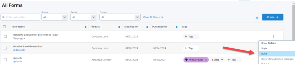
To navigate to the builder of your form, select “Build” in the action menu of your form.
When you have entered the builder of your form, there are several sections and menus that will help you to navigate or edit your page.
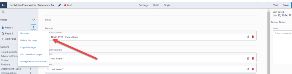
Pages
Starting at the top left under the Pages section, you can:
Navigate to a page by clicking on the page you want to view/edit.
- + Add Page: Will create a new blank page.
- Rename: This will allow you name/rename the title of your page. This title will display in the browser tab.
- Delete this Page: If you no longer need a page on your form or accidently created a new one, hover over the page you want removed and select this option.
- Copy this page: This will create a copy of a page as the last page of your form.
- Edit conditional page: This will allow you to add a condition to skip a page on your form or redirect a visitor to another URL if that visitor meets the criteria built into the condition. For example, let’s say you have a 3 page event registration form. 1st page is contact information, 2nd page is payment, 3rd page is the thank you page. You want to allow registrants from a specific company to register for the event for free. You could add a condition on the first page where if the visitor enters the name of that particular company, they skip the 2nd page (payment) and go straight to the thank you page. You can also use this feature to direct subscribers to a site outside of your page flow by entering the Url in the Target Url field.
- Manage email notifications: You can also add email confirmations to a page here. By adding an email confirmation to a specific page, the user will receive that email confirmation once they land on that page. In most cases, email confirmations should be added to the last page of the form. You can also add multiple email confirmations to a single page and add different conditions to each. That way, if you want to send different emails to different visitors based on criteria they meet, you can do so.
Content
On the left-hand side of the screen, under the Page section, you will find the available elements for you to add to your page. This layout will look similar to what you’ve seen in the Content tab. It will also include fields that are standard across all clients like contact information, payment fields, registration fields, and widgets. To add this content to your form, you will drag and drop the element onto your canvas.
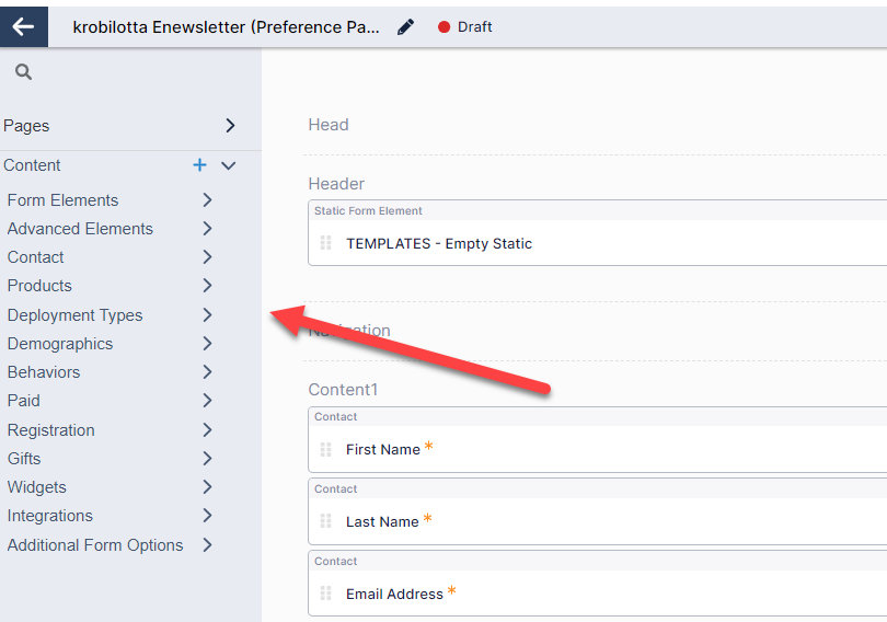
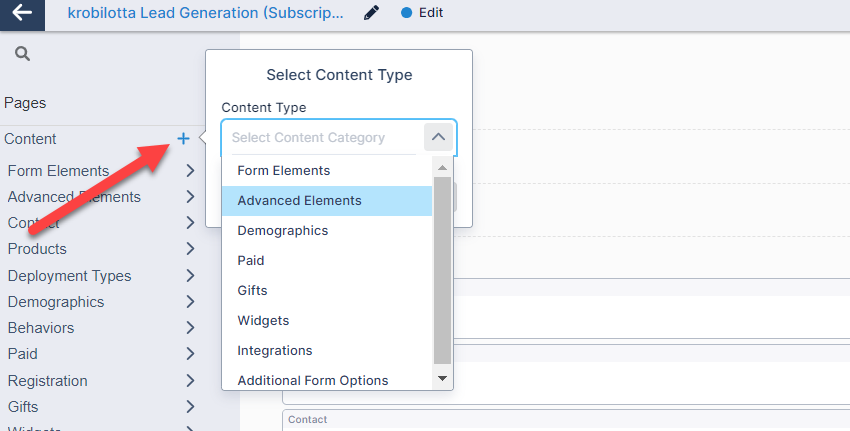
You will be able to create new content in the Builder by selecting the + icon next to Content.
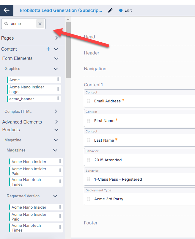
To search for content, use the search bar in the upper left hand corner of the left panel. This will search through all content and display all the results.
To add an element to the form, after finding it in the left panel, click and hold the element and drag it into the appropriate content box in the canvas.
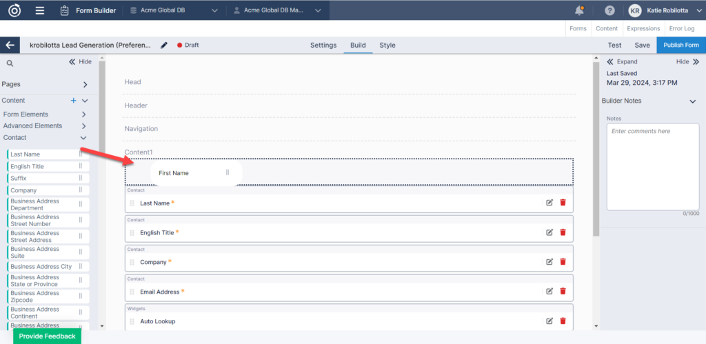
You can also drag on multiple fields at once by clicking a field, then holding the ctrl button, then selecting the additional fields. Or if there are multiple fields in a row in the left panel, select one element, hold shift, then select the last element. All element between the two selected elements will become selected as well allowing you to drag all selected fields onto the canvas.
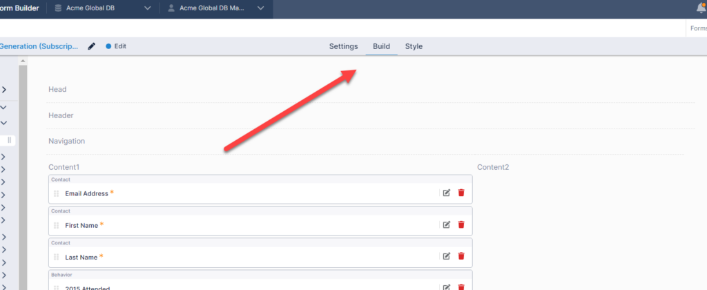
Canvas
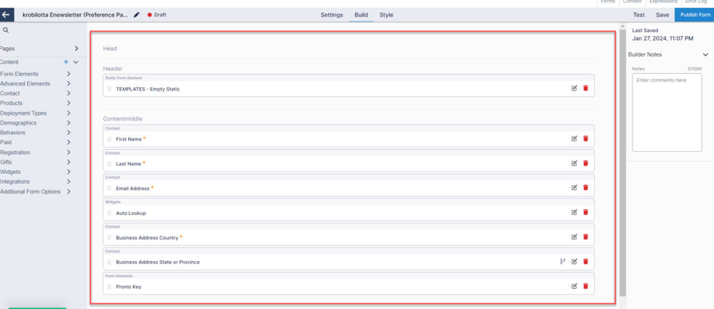
In the center of your screen is the canvas. Here is where you will drag the elements you would like included on your page. The structure of your builder content will be dictated by the theme you chose for your form. All themes will have a consistent layout including the Head, a Header/Logo section, Content sections, and a footer.
Generally, this is how a form should be built:
- Head: This is where any custom stylesheets or javascript should be placed.
- Header or Logo: any images such as a logo, banner, or promotional ad.
- Navigation: This is where you will place any navigation html content. Each theme has a different style set up for the navigation bar (where it’s placed on the page, color, fonts, etc.).
- Content sections (content1, content2, contentmiddle, etc): Field visitors will fill out. For example, any contact information, demos, product subscriptions, etc.
- Footer: This is best used for copyrights, social media links, privacy policies
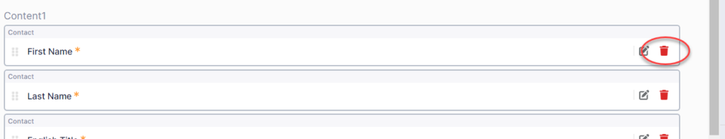
In the canvas, you can also delete content by selecting the red trash can icon, edit content by selecting the paper/pencil icon, and reorder content by dragging and dropping where you want the content to go. Remember to press the Save button to keep any changes made here.
Navigation Menu
In the top middle of your screen is the navigation menu where you can navigate to the Settings page, the builder, or the Style tab.
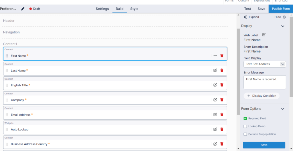
Edit Elements
When you select the edit icon on an element, the element settings will appear in the right panel. Depending on the type of element, you can edit the various settings that apply to that element.
Let’s go through some of these settings:
- Web Label: Allows you to edit what text/html is displayed to the page visitor.
- Field Display: How you want the field to display on the form.
- Error Message: The error message that is displayed should a required question not be completed.
- + Display Condition: Add a condition to your element. This will open a drop down of all expressions created. You can also create a new expression here as well. If an expression is added to an element, the element will only display to the visitor if that expression is met.
- Required Field: If you want a field to be required, check this.
- Lookup Demo: This is used on demographic questions on forms with lookup. If the subscriber is found in the database and this field is checked, their demographic will prepopulate. To use the lookup demo when embedding or linking the form elsewhere (e.g. in an email), you must add r=Encrypted Customer ID to the form URL in order for this to populate any demographics and/or non-standard fields. For more information on URL Structure in Dragon Forms, see here.
- Exclude Prepopulation: This can be used on contact information fields. These fields will automatically prepopulate on a lookup form and checking this field will exclude from prepopulation.
- Copy to pass along: If a passalong content group is used on your form, by checking this checkbox, you will specify which fields from the primary subscriber should pass to the passalong records. For example, if the passalong operator is selected for the Street Address field and the original subscriber inputs ‘123 Normal Ave’, the passalong record will have ‘123 Normal Ave’ as it’s address.
- Minimum Length: To set prevent visitors from filling in spam, you have to option to set your field to a minimum character length.
- Default Value: Allow you to select a default response for your field.
- Inbound Parameter: You can add an inbound parameter to your content if you plan on prepopulating your form from another source. These parameters are also used when exporting data from a form. The fields last name (ln), email address (em) and account number (an) and promo key (pk) are defaulted in the builder.
- Product: You can also specify which product your element will map to. This is rarely used because if your site is built over the product level all data will map to that product. Sites over the company level will map the data to each product present on the site. You may use this for certain payment elements like SKUs.
- + Required Condition: Require your element if a condition you specify is met. You may want your Zipcode element to display for all subscribers, but to only be required if the subscriber’s country is United States or Canada.
- Builder Color: You can also select the Builder Color for your element. This will allow you to organize your content within builder by color, if you should find that helpful.
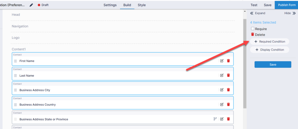
To Require, Delete, Conditionally Display, or Conditionally require multiple elements at once, select all elements on the canvas you want to edit by selecting one and pressing ctrl or shift to select the rest. The right panel will display the Require, Delete, Required Condition, and Display Condition which once selected and saved, all elements will be updated with the edit made.
To remove an element, click the trash icon on the element within the canvas and then save.
Quick View and/or Style you Form
If you want to quickly view your form without testing any functionality, head to the Style tab in the middle navigation.
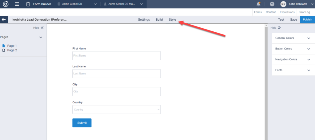
The Style tab allows you to take a quick look at your form to view how it will display to your end users. It also allows you to add different styles including different coloring options, buttons displays, and font styles.
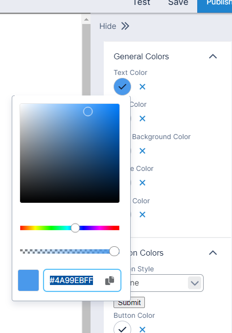
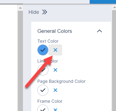
To add styling using the left panel, for the coloring options, select the circle with the check mark and pick a color. You can also add in your own HEX color in the input box of the color picker if you want to stay consistent with your brand’s color code. After selecting a color, remember to press save to view the color update on your form.
To remove the selected color, select the ‘x’ next to the color picker and press save.
Note: If you have custom CSS added to your form using a stylesheet, the Style tab will not be able render all the custom styles included within the file. Please use the Test button in the upper right hand corner to view your form.
Preview your Form
Selecting the Test button in the upper right hand corner will create a test version of your form in a new tab or window. At the end of the test url will be the page number of the form you are on. You can navigate to other pages within your form by changing the number in the url. https://omeda.dragonforms.com/init.do?omedasite=trainingNew&version=1&page=1
You can also test the functionality of your form from this link without creating a live transaction. If you need to test a form that has payment, you can do so using the dummy credit card number below with any expire date.
#4111 1111 1111 1111
Publish your Form
If the look and function of your test link is correct, you can publish your link by clicking Publish in the upper right-hand corner. This will create the ‘Live’ link that will write transactions to our live database.
Make sure to save and preview your site before you publish your changes.